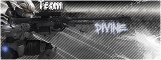
hmm..ok:
il go through your sigs and refer them to numbers.
1: Cant see the point, Outterglows on renders are not good. Unless its black. im assumming this was one fo your first designs.
2: Is actually not bad, but i dont see brush work, i simply see a render and a font.
3: White jaggy lines around the render. turn off. background is aswell, it looks liek you used the filter gallery.
4: Nice lil vectro/abstract design, not bad, render spoils it and the font.
5: Amazing lil design you did there, actually suprised you did it. But yes i love it. One thing though, make sure in renders and background you kind of colour match so it blends nicely.. you sort of have..to an extent.. but master colour schemes

i like this design.
6: a Pixel stretch with a bad brush, some scan lines and a bad colour scheme along with a small render.
7: 3 renders in one design.. i really dont see the point in this.. the brush work would be alot more detailed if the sig wasnt clogged up with renders. and maybe a better brush to boot.
8: no point in commenting read number 6 and the others.
9: Quite good actually, impressed. Render though...not so sure, although it does quite match.. the background colour however doesnt really do the render justice.. find colours in the render you can incorporate into the background. That allways helps

.
10: Ummm.... render does not go with this background at all.
Im not trying to be a smart ass or a no it all cause thats not what iam. But i do have great attention to detail, and i love detailed backgrounds in signatures. Accompanied with a great render, you ahve a serious amount of potential but your doing the sigs backwards allmost. For instance number 5 sig, amazing.. bad choice in colour maybe but amazing none the less. same with 9, only the colour i dont quite get with 9.
If you focused more on colour schemes than on just picking colours you could really go along way.


