Post your signatures and avatars here.

 #101257  by SilentOne
 
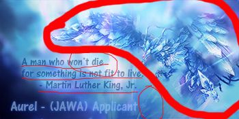
Well the first one is the best of the 2...
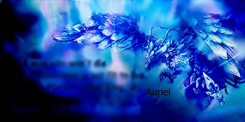
The second one isn't so good..but they'll get better..mine were worse than these when i started.. I have a few tutorials on these forums that are good for beginners.. If you need any sig help you can just pm me on here

Edit: Just saw that the second one isn't finished...theres a few small things you can do to make that pop i suggest removing the large text..its kind of distracting..use smaller text and put it somewhere near the focal point

 #101261  by Aurel
 
SilentOne wrote:Well the first one is the best of the 2...
The second one isn't so good..but they'll get better..mine were worse than these when i started.. I have a few tutorials on these forums that are good for beginners.. If you need any sig help you can just pm me on here

Edit: Just saw that the second one isn't finished...theres a few small things you can do to make that pop i suggest removing the large text..its kind of distracting..use smaller text and put it somewhere near the focal point
Thank you! That honestly was my 2nd signature ever made, the first one was horrible.. lol. I will be sure to check out a few of your tutorials :>, thank you! Also, if you can answer a few questions, i'll just post it here for now. If I have anymore I will definitely PM you.

I really like the first one, but I don't like the text on it at all. I'm trying to figure out where the text would look nicely at. The 2nd one is kind of odd because of the colors, they turned out different than I was expecting. I removed the large text, and what are you meaning by focal point? Like.. where the guy is. maybe at the bottom of his body? If in that case, what should I put in the large space that isn't used?

 #101269  by SilentOne
 
Image

ok i thought it would be better just to kind of show you....Now the big circle is your focal point..a few things with that is make sure any effects you use go with the direction of your focal point or flow. Now the little quote you have...try making that less visible or smaller because a lot of text can throw off the picture. the small circles are good places for text...now the whole empty space thing try making the focal point more in the middle like the second one that way you don't have a lot of unused space...

now i just did a few small things to kind of show you what can be done to make it better

Image
i know i got the name mispelled but you get my point

 #101274  by Aurel
 
That looks so more vibrant then the one I made, and this helped so much! Thank you!!!! I was wondering how I could change the text because I don't have the .PSD anymore sadly. But it looks like you just blurred it out. Nice nice. Thank you!

Image

 #101289  by SilentOne
 
well if you don't have the .psd you can't really change the text

 #101307  by Mandalorian
 
I personally think the first one is best.