Page 1 of 1
Echos Gallery
PostPosted:Tue Jul 22, 2008 1:47 am
by echo

So yeah, I've had Photoshop for about a day and this is what I've come up with so far....
Criticism r welcome.
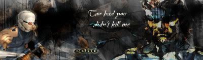
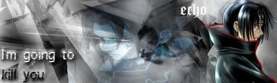
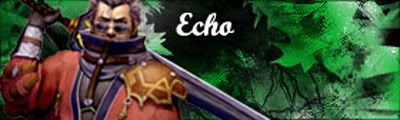
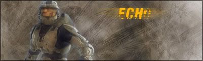
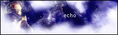
This was my very first one.. kinda dark lulz.
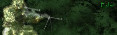
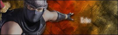
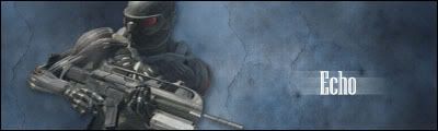
This was my 2nd one. evur.
This one I kinda made out of boredom, also just b/c I felt like including my old name in one.
This is one I also like bunches (duno why) =D
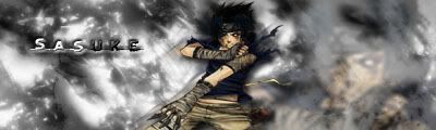
Newer anime based one D:
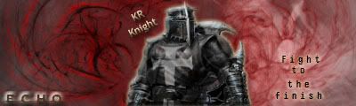
Another one including my favorite char, The Gray Fox
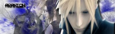
A sig I made for Mr. Aranion.
... A sig I made. lol.
Hip hip, hooray
Hip hip, hooray
Hip hip, hooray
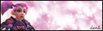
Siggy I made for dent

much luvz
okay
meh
...

sure

dent's re-mastered sig
another for dent

Well that's everything I've got so far, I'll update it as I get bored and spawn more hideous creations.
PostPosted:Tue Jul 22, 2008 1:48 am
by Kakashi.Archive
nice

keep playing with them, they can only get better from here

how i started off ^^ stickyed for yea

PostPosted:Tue Jul 22, 2008 2:35 am
by echo
+2
and
PostPosted:Tue Jul 22, 2008 3:10 am
by Zabuza
i liked the 1st 3rd and 5th
gj echo
PostPosted:Tue Jul 22, 2008 4:33 am
by Darfin
All good.
PostPosted:Tue Jul 22, 2008 4:36 am
by echo
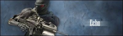
One I made for Aranion~
PostPosted:Tue Jul 22, 2008 11:37 am
by Akimoto
Try adding 2px boarders around the sigs, it makes em look 'cleaner'-- kinda.
And don't free transform them too much! if the picture is W100% / H100% don't change them into pancakes: W100% / H30% <-- bad always keep images 100/100 in scale~ That's all critizism i can think of atm
PostPosted:Tue Jul 22, 2008 3:01 pm
by FlapJack23
Echo wrote:
I like this one a lot.
When you're resizing the render try to only resize from the corner, and hold shift, which will kepp the render even. You also may want to work on color blending so that you don't have a black and white background with a colorful render.
They're good though, keep up the good work!
PostPosted:Sun Jul 27, 2008 1:37 am
by Jato
they're nice.... I DEMAND MORE >:E3 :p
PostPosted:Sun Jul 27, 2008 3:10 am
by echo
hooray... another.
PostPosted:Sun Jul 27, 2008 3:13 am
by Kakashi.Archive
nice bud
PostPosted:Sun Jul 27, 2008 2:10 pm
by Squall
Tips for my friend echo:
Bevel an emboss is good.. but not on renders.. i foudn that out the hard way.
How to do borders:
ctrl+a (make a new layer first) and then go to edit, stroke. Do an inside 1 pxl black. and then you can mess with it on layer settings.
Very good though m8

getting there indeed.
And as aki said, be carefull with free transform. ( CTRL+T ) it Fixes renders that are stretched. But fi you download a already cut render do this:
Image/image size and then set it to percent and tick the box to lock them, then go and change it to 70% to make it a lil smaller but without losing its detail (it will auto do that). Keep doing it untill your satisfied with the size.. means you dont need to use free transform that much.
PostPosted:Mon Jul 28, 2008 3:07 pm
by echo
PostPosted:Mon Jul 28, 2008 9:28 pm
by FlapJack23
I like the second one the best, but the background doesn't match the render. The third one is great on colour blending, but the background is sort of dull. The first one has a sort of blurry render. How are youn blending it with the background?
All in all though, they're much better then my first 11 sigs.
PostPosted:Tue Jul 29, 2008 1:42 am
by echo
FlapJack23 wrote:I like the second one the best, but the background doesn't match the render. The third one is great on colour blending, but the background is sort of dull. The first one has a sort of blurry render. How are youn blending it with the background?
All in all though, they're much better then my first 11 sigs.
I was debating whether or not to make the second one black and white with the background, or black and red.
The first one I resized and it looked good at first, but I noticed I accidently resized the canvass also, and when I resized it to it's regular size it made the render go blurry for some reason.
PostPosted:Sat Aug 02, 2008 10:07 pm
by echo
Sig I made for dent v
PostPosted:Mon Aug 04, 2008 5:32 pm
by echo
^^^^^^^^^^^^^^^^^^^^^^^^^^
PostPosted:Mon Aug 04, 2008 9:51 pm
by dent
toasting in an epic bread
PostPosted:Wed Aug 06, 2008 3:53 am
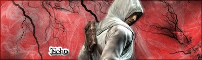
by RaVeN
I like 11 and 13 the best.
11 more, but I wish the vein like background was on the render as well. like if you could blend the render more into the background and make it seem like he is apart of the veins.
Nice theme though, assassin and veins, they go well together
PostPosted:Thu Oct 09, 2008 10:16 pm
by echo
+1
PostPosted:Fri Jun 17, 2011 4:56 am
by echo
lolololol
PostPosted:Fri Jun 17, 2011 9:29 pm
by echo
PostPosted:Sun Jun 19, 2011 5:22 am
by echo