Page 1 of 1
Chupacabras gallery
PostPosted:Mon May 07, 2007 3:30 pm
by chupacabra
I have photoshop for a few weeks and i want to show ya'll what i did, so any comments are welcome.
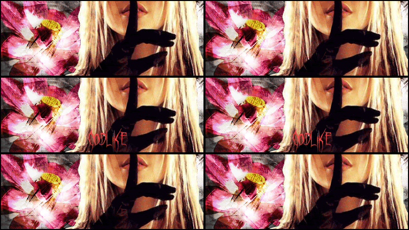
1-godlike
(first one made, with RaVeNs tut)

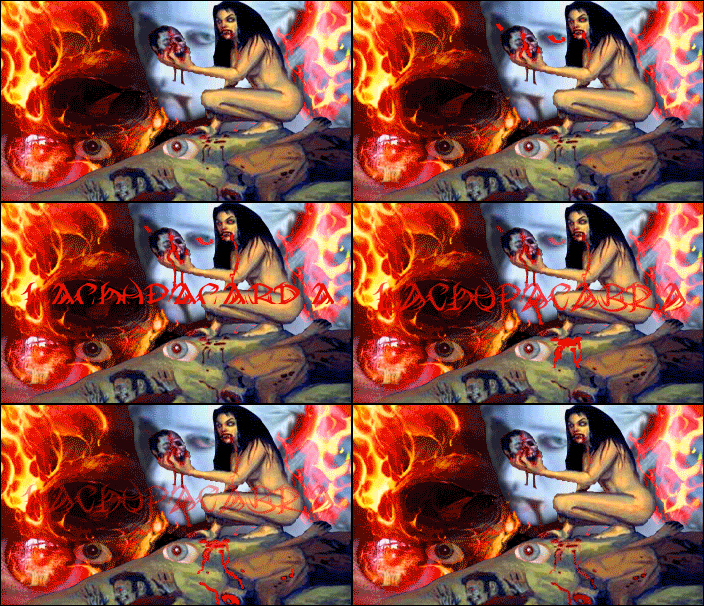
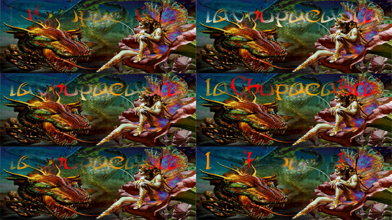
2-laChupacabra
(i wanted to go further...)

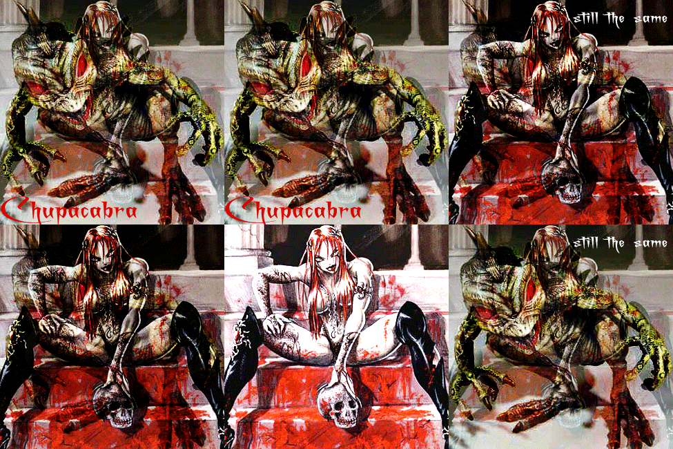
3-Dragonchupa
(just taking it eazy)

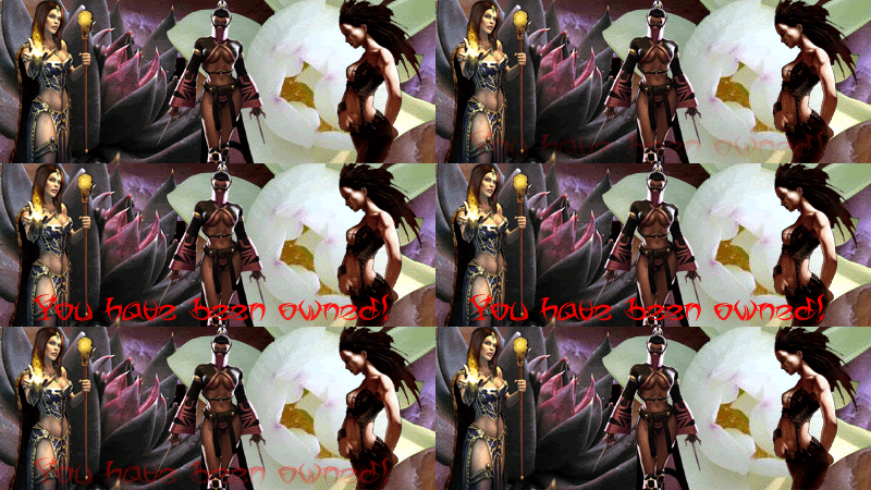
4-Owned by chkepi
(nothing to say)

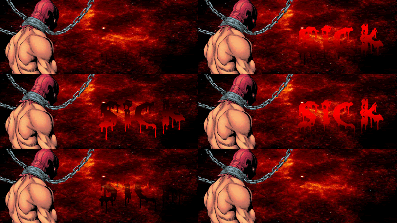
5-Sick
(for a friend named SiCk)

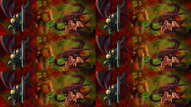
6-dont force me
(created of many inspirations...)

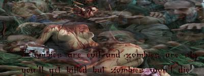
7-Zombies
(7 my lucky number and its dedicated to zombies)

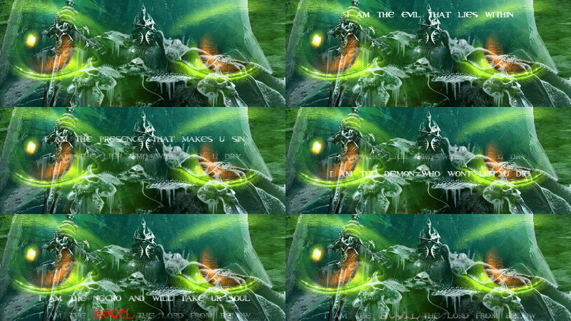
8-lich
(i like rhyming)

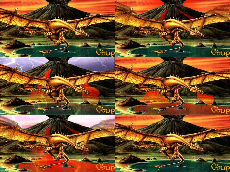
9-chupchup
(too red for Ru)

10-dont quit
(the last one yet)

11-chiupxxx
(the new one

)

12-Slivers
(600x100 exlusive for Seipharr)

13-LjS
(a tribute to my own city of Lj)

this is actually no 16
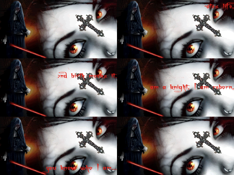
Dark reborn

vampire number 15

yaay no 17 RealChup

18-unnamedfiery

sooo thats it, hope u like my gallery

PostPosted:Mon May 07, 2007 5:05 pm
by Starcomand
look good m8
PostPosted:Thu May 10, 2007 12:24 am
by Kakashi.Archive
I like them all...0_0
PostPosted:Tue Jun 19, 2007 12:56 pm
by chupacabra
arght... changin my sig... btw this is art, fantasy, magic world... i refer to undead, and i like red color... comment sigz in this section of chups gallery... we share different opinions, i love my sigs... what you find depressing i find inspiering (arght don't know how to write that word).
any way WTF but be fine

PostPosted:Tue Jun 19, 2007 1:06 pm
by Kakashi.Archive
I like it all...^^
PostPosted:Tue Jun 19, 2007 7:28 pm
by Starcomand
looking good m8 may talk to u about some for another game i play but would love to learn how to do it i have photo shop 7 on comp would prob need someone to teach me a bit like animation
PostPosted:Tue Jun 19, 2007 11:51 pm
by Nintendo
hey yeah sry for not making this a sticky earlier. Nice sigs I like them.
On a few of the earlier ones it its alittle hard to read the text. Seems like you fixed that though so more power to ya.
PostPosted:Wed Jun 20, 2007 12:44 pm
by Tidus
i like these o.o
castle one is my fav

PostPosted:Mon Jun 25, 2007 11:34 pm
by chupacabra
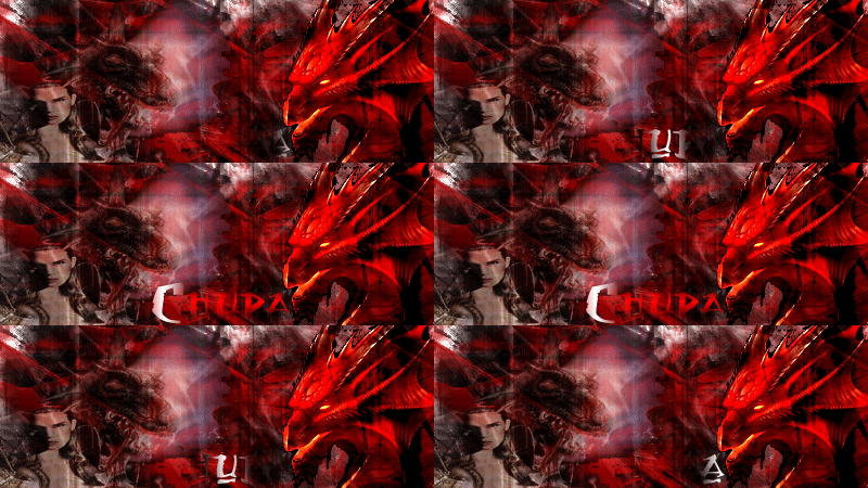
so i wanted to do something realy wicked, so i did this. but im not sure how much i like it, seems a bit noobish to me... but its ql. let me know what you think about my new dragon


PostPosted:Tue Jun 26, 2007 11:27 am
by saunby
looks a bit cheesey i have to admit

but the animation is pretty cool

PostPosted:Sat Jul 21, 2007 11:25 pm
by chupacabra
well i knew i couldn't stay in 400 width limitations -lol- so found new no limits smtg

you wanna see some more of my pictures go here, but it will load some time -lol-
http://com1.runboard.com/bko1233.f3.t1
ya i got 31 pics now (counting is fun)
PostPosted:Sat Jul 21, 2007 11:31 pm
by RaVeN
You're a perfect example of someone who took my Animation TUT and ran with it.
Good job Chupa. Glad to have helped you

PostPosted:Sun Jul 22, 2007 12:07 am
by Grimm
one slight thing i noticed. u need to blend ur renders into the sig. cntrol click the layer to select the entire render then go to select > feather at like 5-10 pixels, then hit the add layer mask button underneath the layers pallete. thatll blend it in ther enicely, over blending is better than under blending.
and once u get that down, u can go crazy with it, look at the sig i just made for wand, all the fade effects were with the feather tool. u can get some pretty wacked effects that look cool.
other than that, most of those were very good, i like em


 )
)